
Showing posts with label infographic. Show all posts
Showing posts with label infographic. Show all posts
Monday, 6 May 2013
How To Chart Good
Having seen all too many charts that have been labored over in vain by students, academics, and practitioners alike, this resonates.
 Irony: it's often difficult to communicate with charts, yet this one does a beautiful job.
Wednesday, 27 February 2013
Growth for the sake of growth, plus ignorance and expertise in complex situations: two depictions
Edward Abbey said “growth for growth’s sake is the ideology of the cancer cell":


Thursday, 24 January 2013
Billionaires of the world ranked and charted
From Flowing data, links and commentary on an interactive chart called "Bloomberg's Billionaires", where you can see who the world's billionaires are and how they compare to each other:


Thursday, 11 October 2012

Friday, 5 October 2012

Monday, 17 September 2012
Which Americans have no health insurance?
The Census has published Income, Poverty and Health Insurance Coverage in the United States: 2011, which yields the following picture of where the 48.6 million Americans without health insurance live (numbers in thousands):
 So almost half live in the south, most of which are red states (opposed to national health care, writ large):

Summary of results of the 1996, 2000, 2004, and 2008presidential elections:

Many (but not all) spend the least on health care:
And they are among the states with the worst health outcomes across the nation:


States carried by the Republican in all four elections
States carried by the Republican in three of the four elections
States carried by each party twice in the four elections
States carried by the Democrat in three of the four elections
States carried by the Democrat in all four elections
Source: Wikipedia
They are also many of the poorest states:

Source: The Poorest States of America
Many (but not all) spend the least on health care:

And they are among the states with the worst health outcomes across the nation:

Source: What Our Health Spending Buys Us
Wednesday, 29 August 2012
What Americans Do All Day
They commute, work, and sleep, mostly. 48 minutes to groom, 34 minutes to care for others, 6 minutes to learn something. Oh, for a country by country comparison. From NPR:


Wednesday, 1 August 2012
Tuesday, 12 June 2012
Middle class wipe out
40% drop in the median income in the past four years. It looks like this:


via Slate, who attributes the result to declining wages and incomes, the stock market crash, and the bursting of the housing bubble. The stock market and housing crash might be considered one-offs (if you're an eternal optimist) but declining wages looks to be structural and endearing in nature, and in fact should worsen because labor is engaged in a global competition, with the result, as we have seen, that productivity gains have not gone to workers:
 via politics of equality blog.
Monday, 4 June 2012


Friday, 20 April 2012
Thursday, 19 April 2012
US and Foreign Employment & Sales by MNCs
Newly released BEA report, Summary Estimates for Multinational Companies: Employment, Sales, and Capital Expenditures for 2010. They just have one little chart on their website:
 So I put together a few more. Here are a couple on their employment data (from tables available in the full report, pdf):
First, you can compare employment in the US and abroad in US-headed multinationals (I didn;t bother putting the date range breaks in, as in chart 1 above):

The numbers are in millions of employees. This seems to indicate that there was an upward trend of foreign hiring up until some time between 2004 and 2007, and then a holding steady of both foreign and US employment within US MNCs since then. BEA's chart 1 seems to express this as a steady decline in US employment, which it certainly is as a percentage of total employment, but it looks like surging foreign employment is responsible for the decline. Also this doesn't necessarily means that grey bars represent only American citizens and orange represent only foreign citizens, since companies may move people around and it may be that many of the grey people are foreign and the orange people American, but in any event it's likely that the majority are citizens of the country in which they are employed.
They also have statistics for US employment by US affiliates of foreign-headed MNCs, but annoyingly the years do not all correspond so this looks a little odd when charted:

Even so we can see that foreign companies hire what looks like about half as many people in the US as US MNCs do abroad, and the employment in the US seems to be holding steady after a slight uptick between 1999 and 2002.
Now a couple on sales. Here are US vs foreign sales of US-based MNCs:


A bit of an upward trend until 2009, no surprise there, with an uptick in 2010 but more modest than that of the US MNCs.

First, you can compare employment in the US and abroad in US-headed multinationals (I didn;t bother putting the date range breaks in, as in chart 1 above):

They also have statistics for US employment by US affiliates of foreign-headed MNCs, but annoyingly the years do not all correspond so this looks a little odd when charted:

Even so we can see that foreign companies hire what looks like about half as many people in the US as US MNCs do abroad, and the employment in the US seems to be holding steady after a slight uptick between 1999 and 2002.
Now a couple on sales. Here are US vs foreign sales of US-based MNCs:

Steadily rising, across the board, but look at the relative picture, sales by US Parent as a percentage of the total sales of US MNCs (BEA didn't provide this data so I calculated as USP sales/(USP sales + foreign affiliate sales):

That looks pretty startling doesn't it. But it just means that overall, for US MNCS, foreign sales are growing faster than US sales. That's one reason to be an MNC--expansion to other markets.
Now here are sales by US affiliates of foreign MNCs added in (again with the mismatched years):

A bit of an upward trend until 2009, no surprise there, with an uptick in 2010 but more modest than that of the US MNCs.
Tuesday, 17 April 2012
Military spending: USA vs rest of the world

From Stockholm International Peace Research Institute, latest military expenditure data. But note that the USA isn't even in the top twenty in terms of per capita spending--that honor goes to the Middle East.
Wednesday, 11 April 2012
Water: a Public Good?
Is water a public good? Privatizing water has led to all kinds of traumatic consequences in poor countries, with many complaints aimed at IMF conditionality-imposed schemes. India is considering a draft bill to privatize water there, where shortage seems particularly imminent: "India has more than 17 percent of the world's population, but has only 4% of world's renewable water resources with 2.6% of world's land area." There is plenty of worry about what the bill will mean in terms of pricing for profit-oriented industry and long-term infrastructural consequences. In a post last month I suggested that I thought waste disposal likely ought to be a public good because a private market would tend to want more garbage (more volume, more profit), while a public system might try to minimize garbage in order to reduce costs or meet other social goals such as conservation--the same principle seems to hold for water.
Visual News has a story (and of course a great infographic) on America's water crisis:

Basically we consume too much, both directly and indirectly, we waste a lot due to aging infrastructure, and we otherwise contaminate it with chemicals. A startling stat: municipal water in 71% of U.S. cities has too much hexavalent chromium in it. If you don't remember why you should worry about that, you just need to think Julia Roberts:
Here is the CIA World Factbook's page on water resources, showing " the long-term average water availability for a country in cubic kilometers," i.e., the total water available to the country in an average year.
The 10 countries with the most water on average:
And the 10 countries with the least:
Visual News has a story (and of course a great infographic) on America's water crisis:

Here is the CIA World Factbook's page on water resources, showing " the long-term average water availability for a country in cubic kilometers," i.e., the total water available to the country in an average year.
The 10 countries with the most water on average:
- Brazil--8,233 cu km
- Russia--4,498 cu km
- Canada--3,300 cu km
- United States--3,069 cu km
- Indonesia--2,838 cu km
- China--2,830 cu km
- Colombia--2,132 cu km
- Peru--1,913 cu km
- India--1,908 cu km
- Venezuela--1,233 cu km
And the 10 countries with the least:
- Kuwait--0.02 cu km
- Saint Kitts and Nevis--0.02 cu km
- Maldives--0.03 cu km
- Malta--0.07 cu km
- Bahrain--0.1 cu km
- Qatar--0.1 cu km
- Antigua and Barbuda--0.1 cu km
- Barbados--0.1 cu km
- United Arab Emirates--0.2 cu km
- Cape Verde--0.3 cu km
Monday, 9 April 2012

Sunday, 8 April 2012


Saturday, 31 March 2012
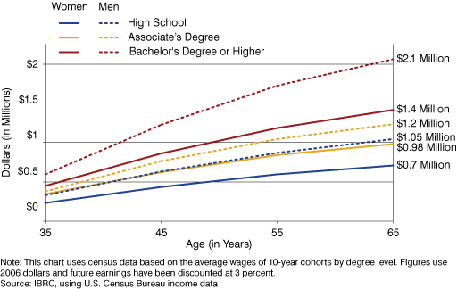
How do we spend our money: US vs. rest of the world
American consumers spend more on health care and housing, less on food and clothes than consumers in Canada, Britain, and Japan.. From the NYT's Catherine Rampell, economix blog:


As we know, it's a lot more on health care:

Saturday, 24 March 2012


Subscribe to:
Posts (Atom)